Captions and transcripts
How do you make captions people actually read?
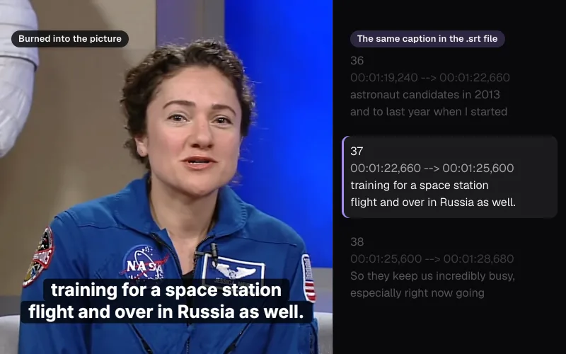
We burned captions into a NASA studio interview and a NASA short made for phones with Auto Subtitles, exported them eight ways and measured every caption against the BBC's, the W3C's and Netflix's figures.
By the Cutlia team · Published · 16 min read
The short version
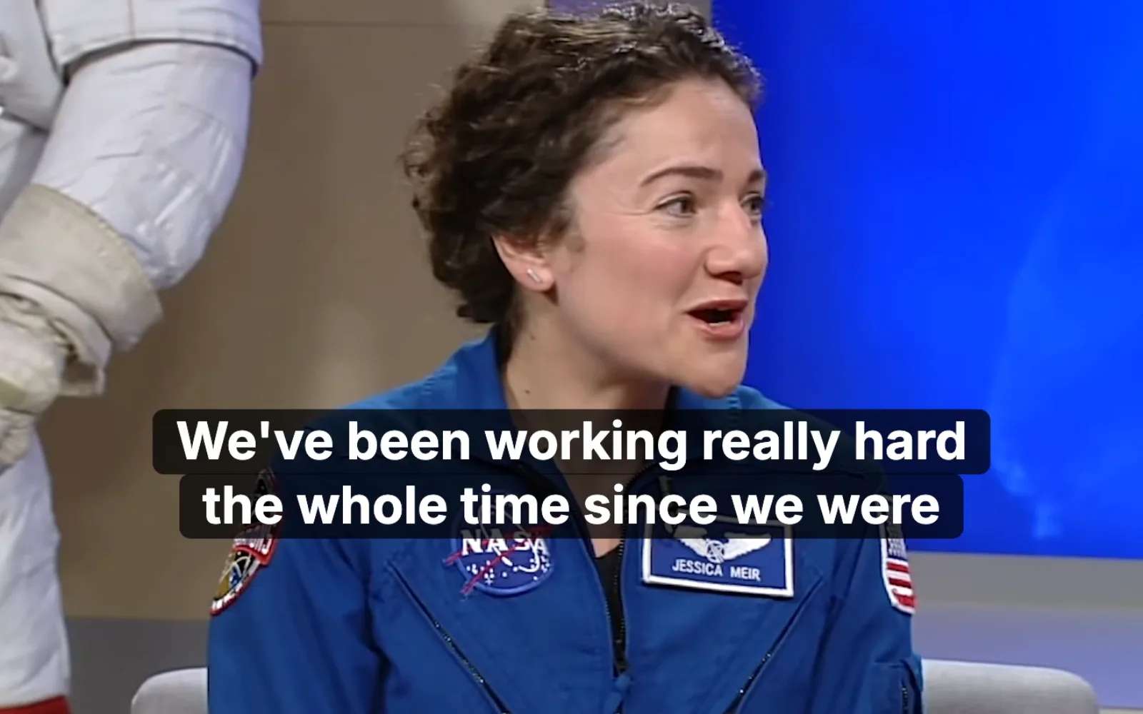
- Check the words before the style: speech recognition turned a NASA interview into 394 words of captions but spelled the host's name “Brandy” twice, while her name card on screen says Brandi, and one Find & replace fixed both.
- Keep lines short and use two at most on a widescreen video (three on a vertical one): the BBC limits a line to 68% of a 16:9 frame's width, and in Auto Subtitles the lines on the picture follow “Max width”, not the character count, so set both “Line length” and “Max width”.
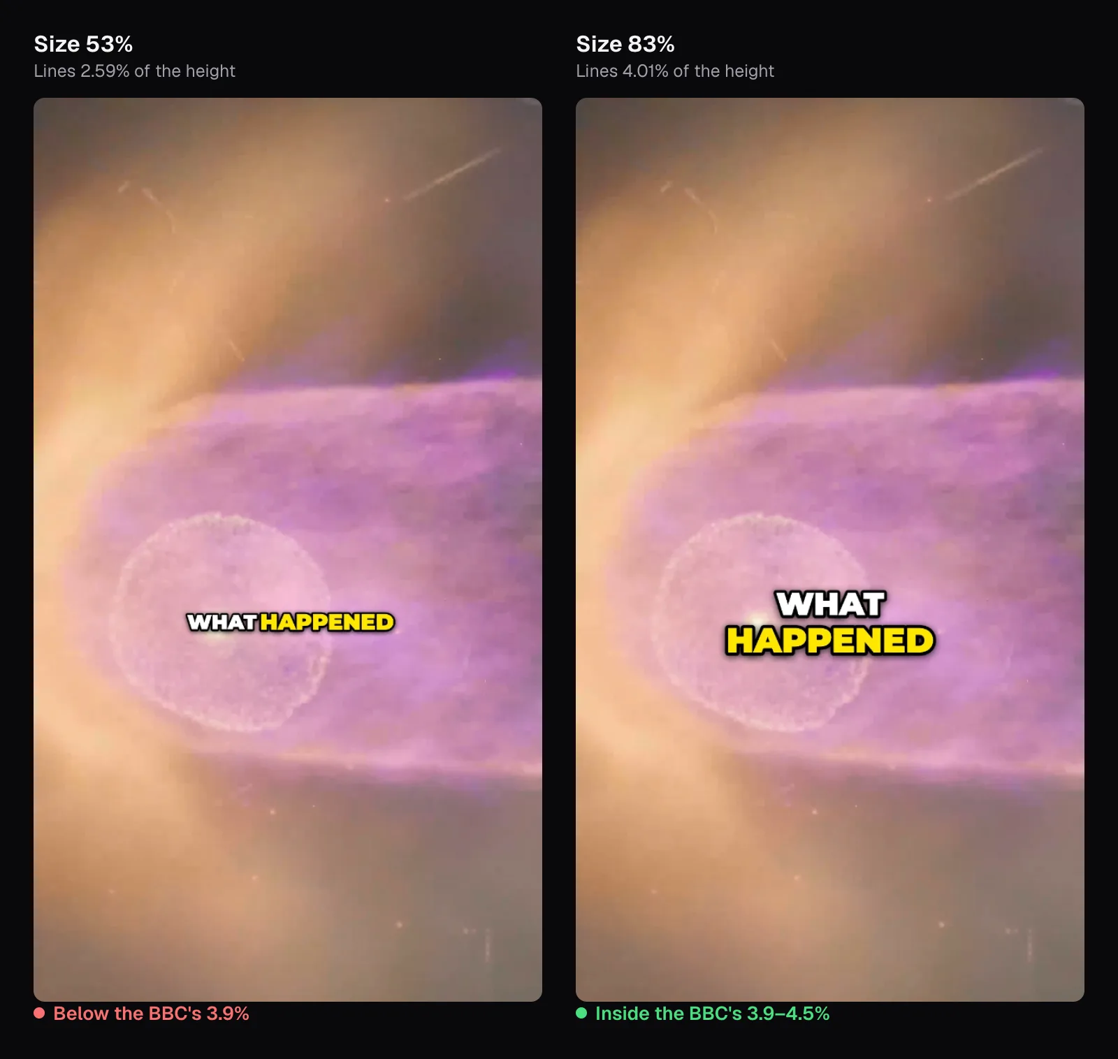
- Make a line 7–8% of a widescreen frame's height or 3.9–4.5% of a vertical one's: in Auto Subtitles that is “Size” 82–92% for Bold and 75–85% for Classic on either shape.
- Give white letters an edge of their own: on a bright frame of tree rings, plain white text scored 1.43:1 or less against half the pixels behind it, under WCAG's 3:1 for large text, while a black outline puts 21:1 right at every letter's edge.
- Keep captions clear of names on screen and of the app's overlays: on our vertical video Bold as it comes put all 84 captions in TikTok's bottom zone, while “Position” 58%, “Size” 83% and “Max width” 40% kept every one inside the safe zone.
A caption has a moment to be read before the next one replaces it. Lines that cross the whole frame, letters too small for a phone, white text on a white sky, words under an app's buttons or over a name on screen: each turns a sentence into a flicker. The BBC's Subtitle Guidelines give figures for line length, lines on screen, reading speed, size and position, vertical video included; the W3C and WCAG add accuracy and contrast.
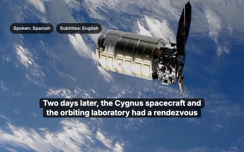
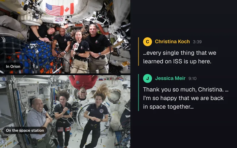
We held those figures up to real captions made with Cutlia's Auto Subtitles. First a NASA studio interview: astronaut Jessica Meir and NASA's Brandi Dean in two armchairs, with Christina Koch on the space station, 1 minute 50 at 1920 × 1080, transcribed in the browser. Then a NASA short made for phones, 1080 × 1920, about the bubble the Sun blows around the planets. Its soundtrack carries licensed music, so we never let Auto Subtitles listen to it: its words come from NASA's own caption file. Our test script wrote them, each caption's words spread over its time, into the captions Auto Subtitles keeps for that video (the editor has no caption-file import), and the editor opened on them, regrouping NASA's 59 captions into 84 in its “Short lines” format. We exported the interview three ways and the short five, found the captions on the exported frames pixel by pixel, and measured them.
Get every word right before you style anything
The W3C's guidance on captions is blunt: automatically generated captions “do not meet user needs or accessibility requirements, unless they are confirmed to be fully accurate.” Its example is a recipe where “4 to 5 minutes” was captioned as “45 minutes” and “should not preheat” as “should know to preheat”.
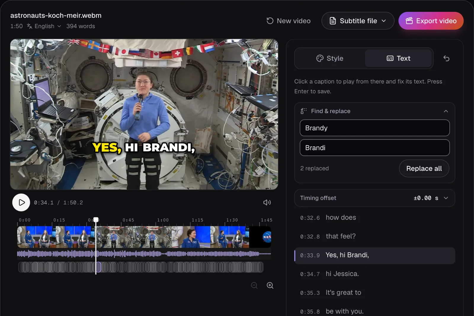
Our interview came back as 394 words, with the two astronauts' names, Meir and Koch, spelled right. The host's wasn't: Koch says it twice from the station, and both times the captions read “Brandy”, while the name card NASA puts on screen eight seconds in reads Brandi Dean. Recognition spelled the name like the common word; the name cards, the video's description or the speakers' own pages tell you which spelling is right.
In the “Text” tab every caption is listed with its start time. Click one to play from there and retype it; Enter saves. Words you keep keep their exact times, and new words share the time of the words they replace, so an edit never knocks the captions out of step. “Find & replace” changes a word everywhere at once: “Brandy” to “Brandi” reported “2 replaced”.
Professional files slip too: NASA's caption file for the short has “when more cosmic rays” in one caption and “rays reached Earth” in the next: “rays” twice. Read the whole list once against the sound. Accuracy is the subject of our guide to transcribing video; if you start from a transcript in Video to Text, its “Make captions” brings your corrections over.
What Auto Subtitles does with the words by itself
Speech recognition gives a list of words, each with the moment it starts and ends. Turning that into captions is a separate job, and “Captions show” decides how it's done:
- “Short lines”: one line of up to 18 characters, covering at most 3 seconds of speech. Made for vertical video.
- “Subtitles”: up to two lines of 42 characters, at most 7 seconds of speech.
- “One word”: each word alone.
Within those limits, a caption never runs past the end of a sentence or across a pause of 0.6 seconds. When the rest of a sentence needs two captions, it is cut into two halves of about the same number of characters, nudged toward a comma. Each caption appears with its first word and stays 0.4 seconds after its last, and at least 0.6 seconds in all, unless the next one starts sooner; a gap shorter than 0.3 seconds between two captions is closed, so the screen doesn't blink between them. The same 394 words made 139 captions as Short lines, 44 as Subtitles and 394 as One word.
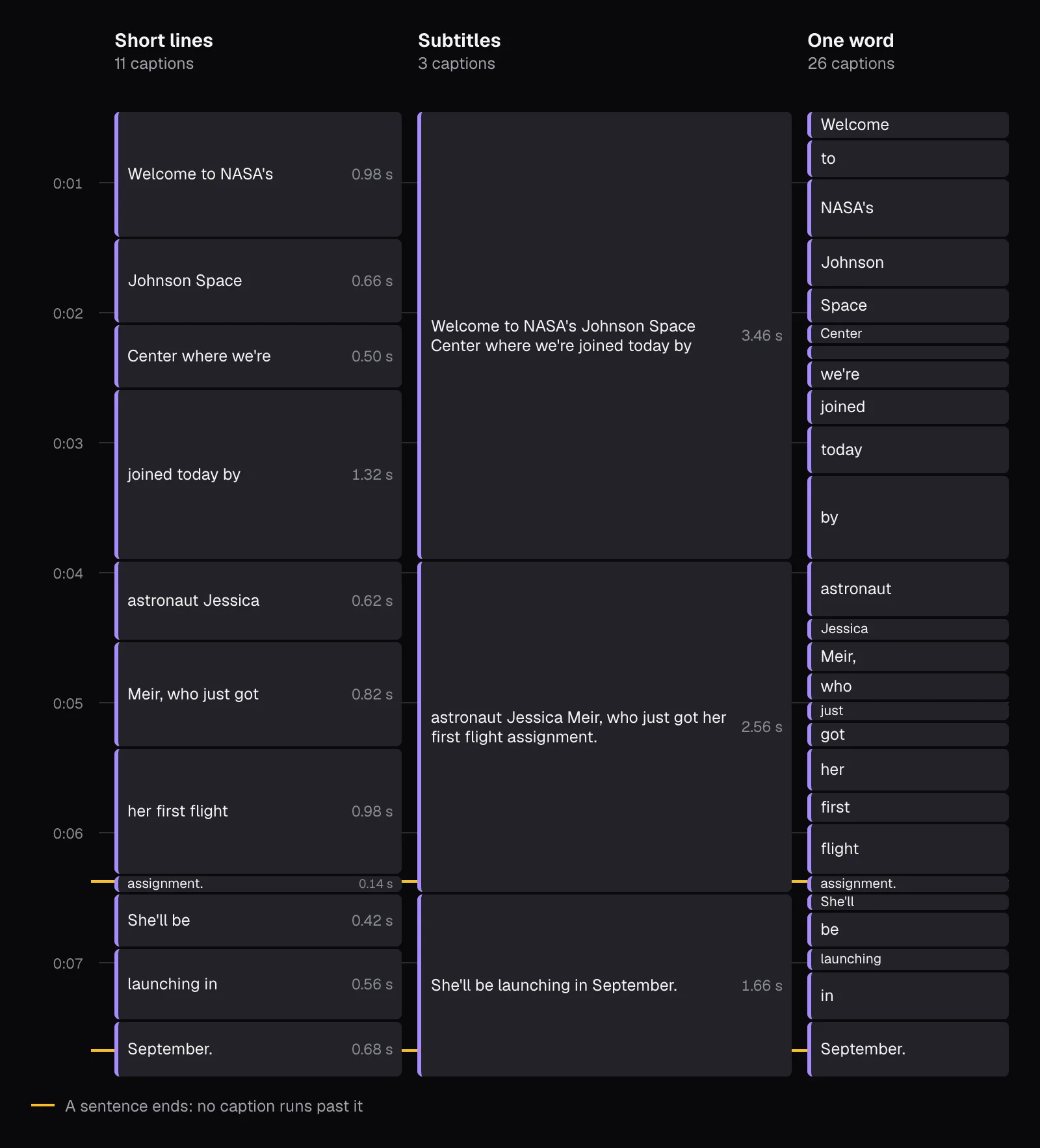
The diagram also shows the weakness of short captions: they inherit every hurry in the speech. Split as evenly as its characters allow, the end of the first sentence left its long last word alone. Recognition timed “assignment.” at 0.04 seconds and the next sentence started 0.1 seconds after it, so Short lines showed the word for 0.14 seconds, too short to read. Subtitles showed it with the rest of its sentence for 2.56 seconds.
Burned into the picture, a caption is then laid out by width, not by count. “Line length” (8 to 32 characters for Short lines, 24 to 60 for Subtitles) decides where a caption ends. The lines you see are as few as fit inside “Max width”, a share of the frame's width from 40% to 96%, then evened out so that one isn't long and the next a single word. A word wider than “Max width” shrinks its whole caption to fit. Captions placed low grow upward from their position and captions placed high grow downward, so the edge near the border stays put, and none comes closer than 4% of the height to the top or bottom.
Keep lines short, and two of them at most
The guidelines agree on the shape of a caption, and differ a little on the numbers:
- W3C: captions are one or two lines, generally best kept under 32 characters a line.
- BBC: 37 characters for Teletext on broadcast TV. Online, where letters differ in width, a line may fill 68% of the width of a 16:9 video and 90% of a 9:16 one; as a guide, 37 characters in a 75% region of a widescreen frame match about 25 in a 90% region of a vertical one. Two lines at most for landscape and square video, three for vertical.
- Netflix: 42 characters a line, two lines at most, in its English style guide as of November 2026.
The BBC adds a counterweight: when choosing between one long line and two short ones, look at the picture, because “long and thin” subtitles are generally less disruptive of it than “short and fat” ones.
Classic, the first of Auto Subtitles' four two-line presets, uses the Subtitles format with a “Line length” of 42 and a “Max width” of 80%. Its subtitle file kept every line within 42 characters, but burned into our interview the lines followed the width: at Classic's size an 80%-wide line holds a lot of text, and the longest ran to 58 characters. 21 of its 44 captions had a line over 37 characters, and 4 were wider than the BBC's 68%. The file and the picture can disagree, so judge what's burned in by looking at it.
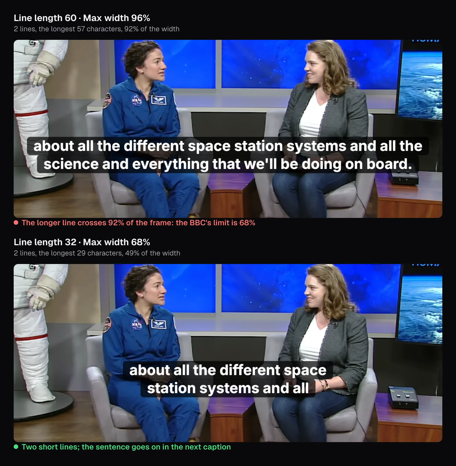
Turned all the way up (“Line length” 60, “Max width” 96%), lines reached 57 characters and 92% of the frame, 17 of 34 captions were wider than 68%, and one took three lines. Turned down to a “Line length” of 32 and a “Max width” of 68%, with “Size” at 80%, none was wider than 68% (the widest 66%), none had more than two lines, and only 6 of 48 had a line over 37 characters. That meets the BBC's rule for online video, which is the width; the 37-character count is Teletext's.
Vertical video is narrower, so each line holds less. Bold, the first preset, writes in capitals at a size where “WEATHER-PROOFING”, 16 characters, spanned 91.5% of a 1080-pixel-wide frame. Its “Short lines” format keeps captions to 18 characters, which is why it suits phones.
Leave each caption up long enough to read
The BBC recommends 160 to 180 words a minute, 0.33 to 0.375 seconds a word, with around 0.3 seconds a word as the least a caption should stay up: 1.2 seconds for four words. Captions should appear as the speech starts and not linger more than 1.5 seconds after it, and a gap between two captions should last at least a second, better a second and a half, or the effect is jerky. Netflix counts characters instead: up to 20 a second for adults and 17 for children, each caption on screen for at least five sixths of a second and at most 7 seconds.
Reading speed starts with the speaker. Our interview held 394 words in 104.5 seconds from the first word to the last: 226 words a minute, 20.2 characters a second. Captions that keep every word have to go by at about that pace on average, whatever the format. The BBC notes that viewers tend to prefer verbatim subtitles, so the rate may be adjusted to the pace of the program, but for a very fast speaker it says to edit as much as is needed to meet its timings. NASA's own captions for the short ran slower, at a median of 16.5 characters a second.
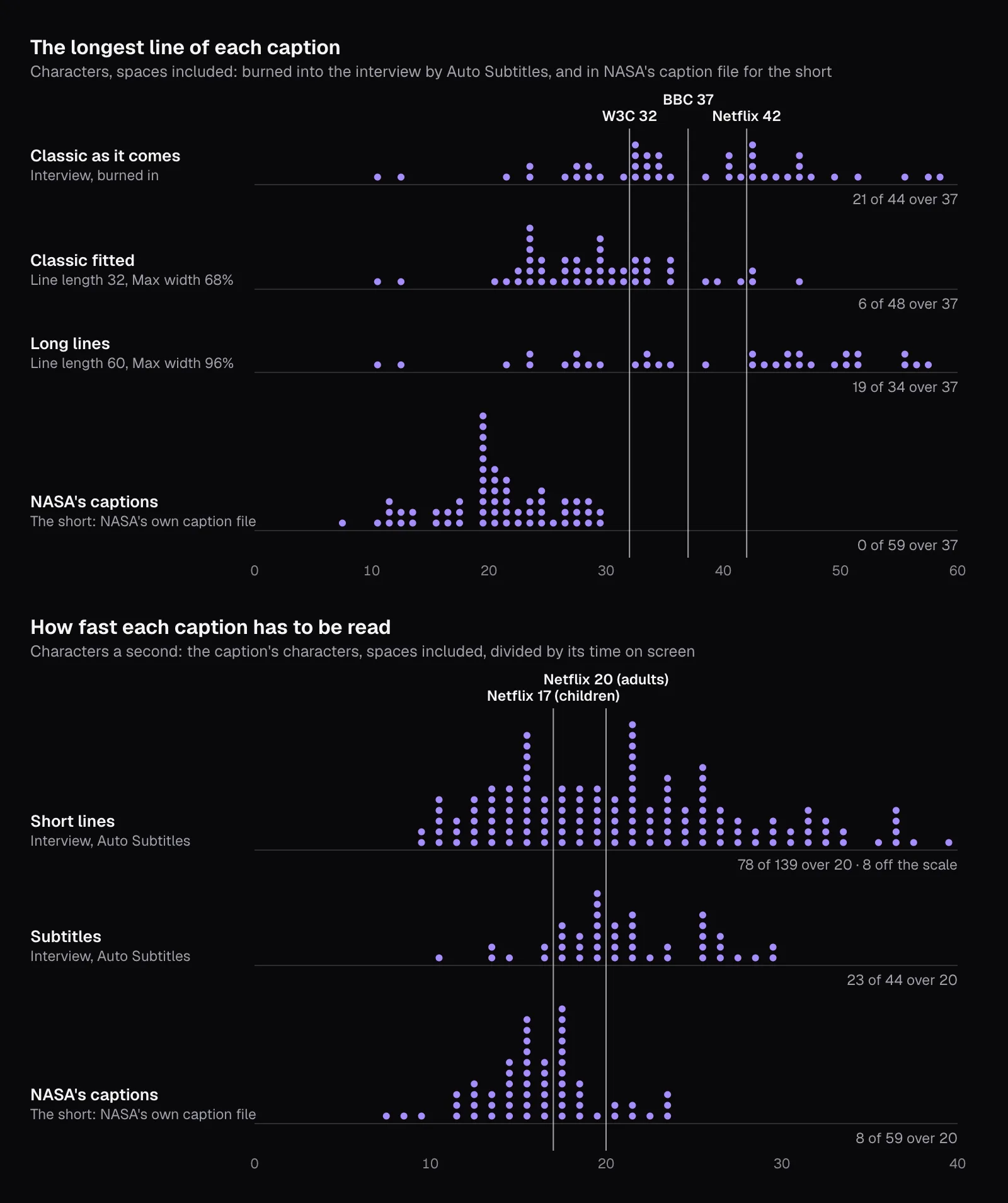
The format decides how long each caption stays, and that is what a viewer feels. As Short lines, the median caption was up for 0.66 seconds and 97 of 139 were shorter than five sixths of a second; 95 fell under the BBC's 0.3 seconds a word. As Subtitles, the median was 2.3 seconds and only one of 44 was that short: “All right.”, at 0.56 seconds, though at this pace 33 of 44 still fell under 0.3 seconds a word. NASA's own file, with lines of at most 29 characters, had 4 of 59 captions under five sixths of a second and 11 under the BBC's minimum. In all three, the gaps between captions were mostly shorter than the BBC's second: 5 of the interview's 7 and 10 of NASA's 12.
For a fast talker, choose Subtitles, or cut what doesn't carry meaning. The W3C says that for most web content it's acceptable to leave out non-substantive words, and its example drops the coughing, a “sorry”, an “uhhh”, a “what was I saying?” and a repeated phrase; the BBC warns against cutting short words such as “but”, “so” or “too” by reflex, because they carry meaning. When you remove words in the Text tab, the words left keep their times, so the same seconds hold fewer characters.
Make the text big enough for the screen
The BBC sizes subtitles by line height as a share of the picture's height: 7 to 8% for 16:9, 4:3 and square video, 3.9 to 4.5% for vertical. The two ranges describe the same size of text: 4.5% is 8% multiplied by 9/16, so a line is about the same size whether the phone is held sideways or upright. On a 1080 × 1920 video, that's a line 75 to 86 pixels tall. Players may shrink the BBC's authored size on big screens, but for small phones it says the size should stay as authored, and a burned-in caption can't be resized by anyone.
Auto Subtitles sizes text as a share of the frame's shorter side: “Size” 100% is 7.5% of it. A setting therefore gives the same proportions on both shapes, and a preset inside the BBC's range on one is inside it on the other. As they come, most presets are outside it:
| Preset | Size as it comes | Line height, 16:9 | Line height, 9:16 | Size for the BBC's range |
|---|---|---|---|---|
| Bold | 100% | 8.63% | 4.85% | 82–92% |
| Boxed | 87% | 7.48% | 4.2% | 82–92% |
| Classic | 67% | 6.25% | 3.52% | 75–85% |
| Cinema | 73% | 6.6% | 3.71% | 78–88% |
| Minimal | 56% | 5.46% | 3.07% | 72–82% |
| One word | 173% | 14.95% | 8.41% | 82–92% |
Bigger than the range isn't wrong for a few punchy words, but it covers more of the picture; smaller is the worse mistake, because on a phone it gets hard to read. Classic as it comes, at 6.25% of a widescreen frame's height, is below it, which is why we raised it to 80% for the interview: 7.5%, the BBC's own example of an acceptable value.
Give the letters a contrast of their own
WCAG, the W3C's accessibility standard, asks for a contrast ratio of at least 4.5:1 between text and its background, or 3:1 for large text (18 point, or 14 point bold), and the rule covers text drawn into an image. The ratio compares how much light the two colors give off, from 1:1 for the same color to 21:1 for white on black. Behind a caption, the background changes every frame; the BBC types most subtitles in white on a black background “to ensure optimum legibility”.
We measured it on a bright moment of the short, a cross-section of a tree trunk, pale yellow and pink. The rectangle the caption covers at 0:47 holds 86,067 pixels of wood. Against half of them, white text scores 1.43:1 or less, and against 99.4% it is under 3:1, the minimum even for large text.
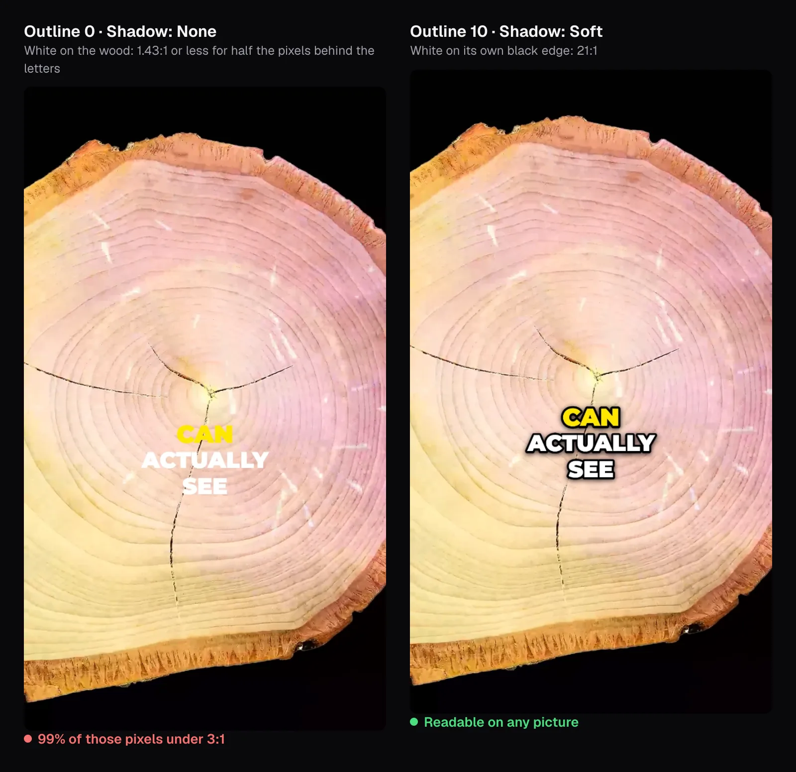
WCAG has a note for exactly this: a border around letters adds contrast and counts in the calculation, a narrow one as part of the letter, a wide one that fills in the letters' inner details as a halo, part of the background. Bold's “Outline” of 10 is a tenth of the font size, 6.7 pixels at the size we used: the white letters meet black right at their edge, 21:1 whatever the picture does, and the black edge is what stands out against a bright picture. Auto Subtitles offers three ways to give text its own background:
- “Outline”, in any color, as Bold and most short-form presets have it.
- “Shadow”: “Soft”, “Hard” or “Glow”, in the color you pick, on its own or under an outline.
- “Background”: a band behind each line (“Per line”) or one box behind all of them, at the opacity you choose. Classic's band is black at 72%; over a pure white picture, white text on it still measures 9.29:1.
The color of the spoken word needs the same edge. Bold's yellow gives off less light than white, so on the wood it fared worse: 1.13:1 or less against half the pixels, and “CAN” all but vanishes in the left frame.
Keep captions clear of names, faces and the app's overlays
The BBC keeps subtitles for online video within the central 90% of a 16:9 frame's height and 75% of its width, and the other way round for vertical video: 75% of the height and 90% of the width. Within that, its rule is not to cover what matters: “it is most important to avoid obscuring ‘on-screen’ captions, any part of a speaker's mouth or any other important activity.”
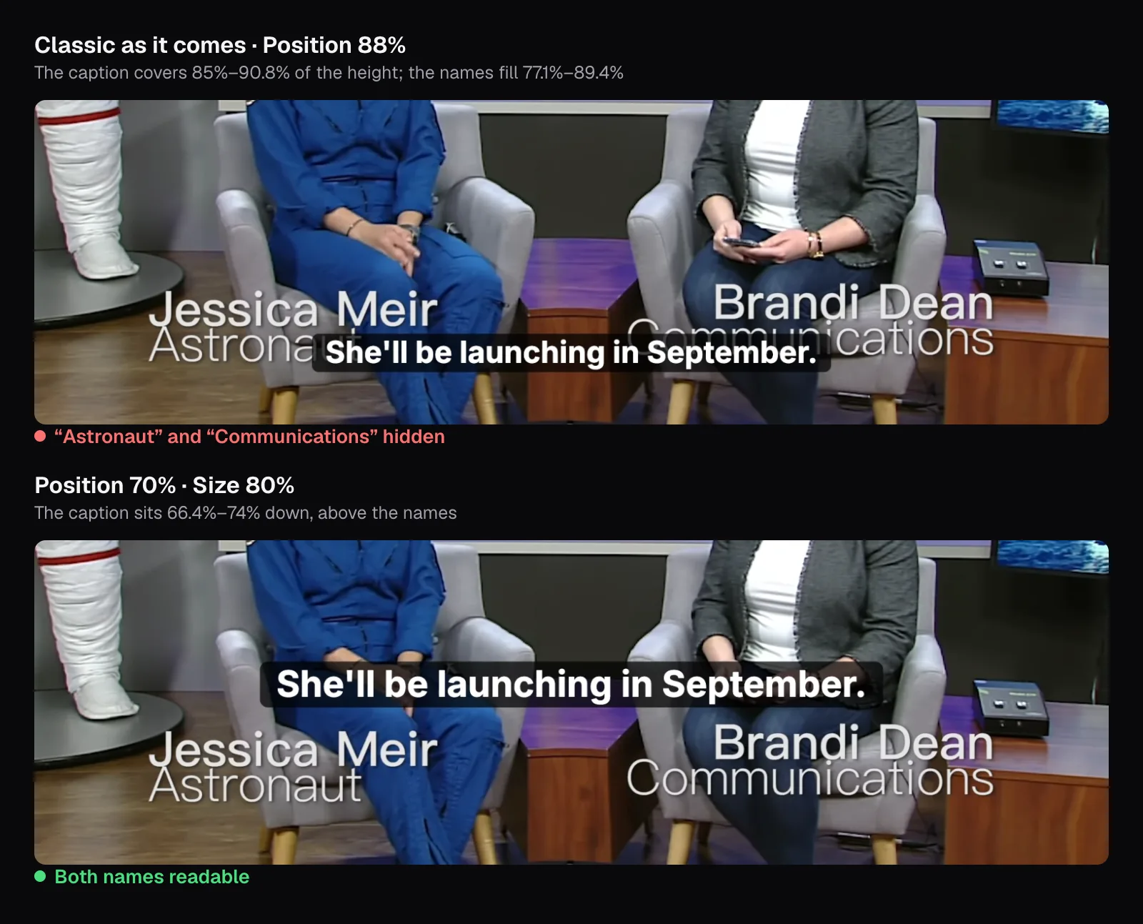
Our interview shows the trap. Eight seconds in, NASA's name cards fill the band from 77.1% to 89.4% of the frame's height, and Classic sits 88% of the way down: its caption covered 85% to 90.8%, hiding “Astronaut” and “Communications”. Auto Subtitles has one “Position” for the whole video, so it has to suit every shot. At 70%, the caption sat between 66.4% and 74% of the height, above the names, and in every shot we looked at it fell below the faces, on chests and laps.
On vertical video, the app adds its own layer. The BBC notes that vertical subtitles are commonly placed a little higher, “though still generally in the lower third of the screen”, because faces are generally in the top half. TikTok's help for in-feed ads says, as of November 2026, that the safe zone depends on the video's shape, the ad caption's length and any extra formats, and offers template files. The standard one, on a 720 × 1280 frame, marks the top 160 pixels, the bottom 440, 80 on each side, and a column 120 pixels wide just inside the right margin, 720 pixels tall from the bottom. It's drawn for ads; we used it as a strict test for any post.
Scaled to 1080 × 1920, a caption has to end above 1,260 pixels, 65.6% of the height, which puts the BBC's whole lower third inside TikTok's bottom zone. Bold as it comes, at 72%, reached into the bottom zone with all 84 of the short's captions, into the right-hand column with 77 and into the side margins with 27.
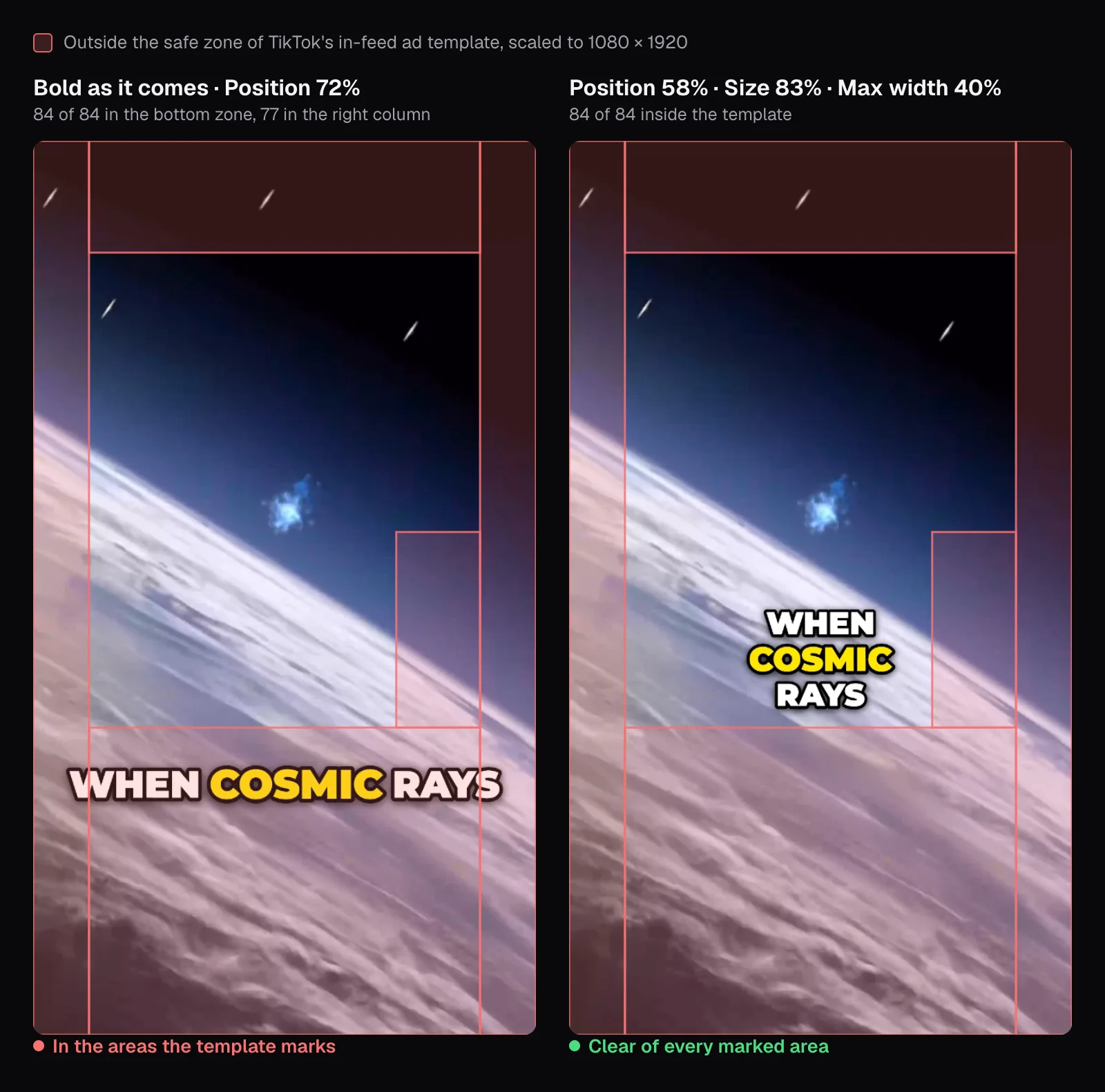
Moving it up is half the fix; the right-hand column, which begins 72% of the way across, is the other. A centered line clears it only if it is less than 44% of the width. With “Max width” at exactly 44%, 20 of 84 captions still reached up to 17 pixels into it, each holding a long word such as “HELIOSPHERE” or “SUPERNOVAS”. Bold draws the word being spoken 8% bigger (“Pop the spoken word”), and the outline adds its own width on each side. At 40%, with “Position” 58% and “Size” 83%, every caption stayed inside. The price is shorter lines: 62 of the 84 captions took two lines and 11 took three, the most the BBC recommends on vertical video. For each app's frame and length limits, see our specs guide.
Which settings to start from
| Your video | Captions show | Start from |
|---|---|---|
| Widescreen: an interview, a lesson, a talk | Subtitles | Classic, Size 80%, Line length 32, Max width 68%; Position above any names on screen |
| Vertical, for TikTok, Reels or Shorts | Short lines | Bold, Position 58%, Size 83%, Max width 40% (clear of TikTok's ad template) |
| A fast talker | Subtitles | Classic as above; remove words that carry no meaning in the Text tab |
| Bright or busy footage | Either | Keep an Outline or a Background; never plain white alone |
Whatever you start from, finish the same way: read the Text tab against the sound, then watch the export once on a phone, muted, at full speed, without pausing. Every caption you had to read twice is too long, too fast or too faint.
Burned-in captions travel with the picture wherever it's posted. Where the player takes a caption file, viewers can switch it off, and some players let them change its size and colors; Auto Subtitles' “Subtitle file” saves the same captions as SRT or VTT. Which to choose is the subject of our guide to caption files, and for a video in another language, English subtitles for a foreign video.
Questions people ask
How many characters should a caption line have?
The W3C suggests generally under 32, the BBC allows 37 on broadcast Teletext, and Netflix's English guide 42. Online, the BBC limits the width instead: 68% of a widescreen frame, 90% of a vertical one, which it puts at about 25 characters on a 9:16 video. Burned-in lines follow the width, so check what's on the picture, not only the file.
How long should a caption stay on screen?
Long enough to read. The BBC recommends 160 to 180 words a minute and, from that, a minimum of around 0.3 seconds a word on screen: 1.2 seconds for four words. Netflix asks for at least five sixths of a second and at most 7 seconds per caption, at up to 20 characters a second for adults. Short captions on fast speech fall below that easily.
What size should captions be on a vertical video?
The BBC asks for a line height of 3.9 to 4.5% of the picture's height on 9:16 video, which on a 1080 × 1920 frame is a line 75 to 86 pixels tall. In Auto Subtitles, Bold lands there with Size between 81% and 92%, and Classic between 74% and 85%; Bold as it comes is slightly bigger, at 4.85%.
Where should captions go on TikTok?
Clear of what TikTok's in-feed ad template marks on a 720 × 1280 frame: the top 160 and bottom 440 pixels, 80 on each side, and a 120-pixel column just inside the right margin, 720 pixels tall from the bottom. On our 1080 × 1920 short, Bold at Position 58%, Size 83% and Max width 40% kept all 84 captions inside.
Are automatic captions good enough to post as they are?
Not without a read-through. The W3C says automatic captions don't meet people's needs unless confirmed fully accurate, and that one missed word such as “not” can reverse a sentence. Ours turned a 394-word interview into captions but spelled the host's name wrong twice. Check names against the screen, then play the video through with the captions list open.
Should captions be in all caps?
Only in short bursts. The BBC warns that large chunks of text in capitals can be hard to read, and the W3C keeps capitals for shouting. Capitals suit captions of a few words, as Bold shows them on vertical video. For two-line subtitles, switch “All caps” off, or start from Classic, Clean or Cinema.
Sources
Where the facts in this guide come from, besides our own tests:
- BBC Subtitle Guidelines (version 1.2.5, March 2026) — BBC
- Captions/Subtitles — W3C Web Accessibility Initiative
- Transcribing Audio to Text — W3C Web Accessibility Initiative
- Understanding Success Criterion 1.4.3: Contrast (Minimum) — W3C
- English (USA) Timed Text Style Guide — Netflix Partner Help Center
- Timed Text Style Guide: General Requirements — Netflix Partner Help Center
- TikTok Auction In-Feed Ads (safe zone files) — TikTok Business Help Center
- Our Home In Space Series (captions for Part 2) — NASA Scientific Visualization Studio
Footage in this guide
The pictures were made with Cutlia's tools from this openly licensed footage, found on Wikimedia Commons:
- Astronauts Koch and Meir React to International Space Station Mission Updates — NASA, Public domain
- Our Home In Space Series (SVS14898 - 2 YT) — NASA's Scientific Visualization Studio, Public domain